Logicor

Unifying and humanising a global logistics brand

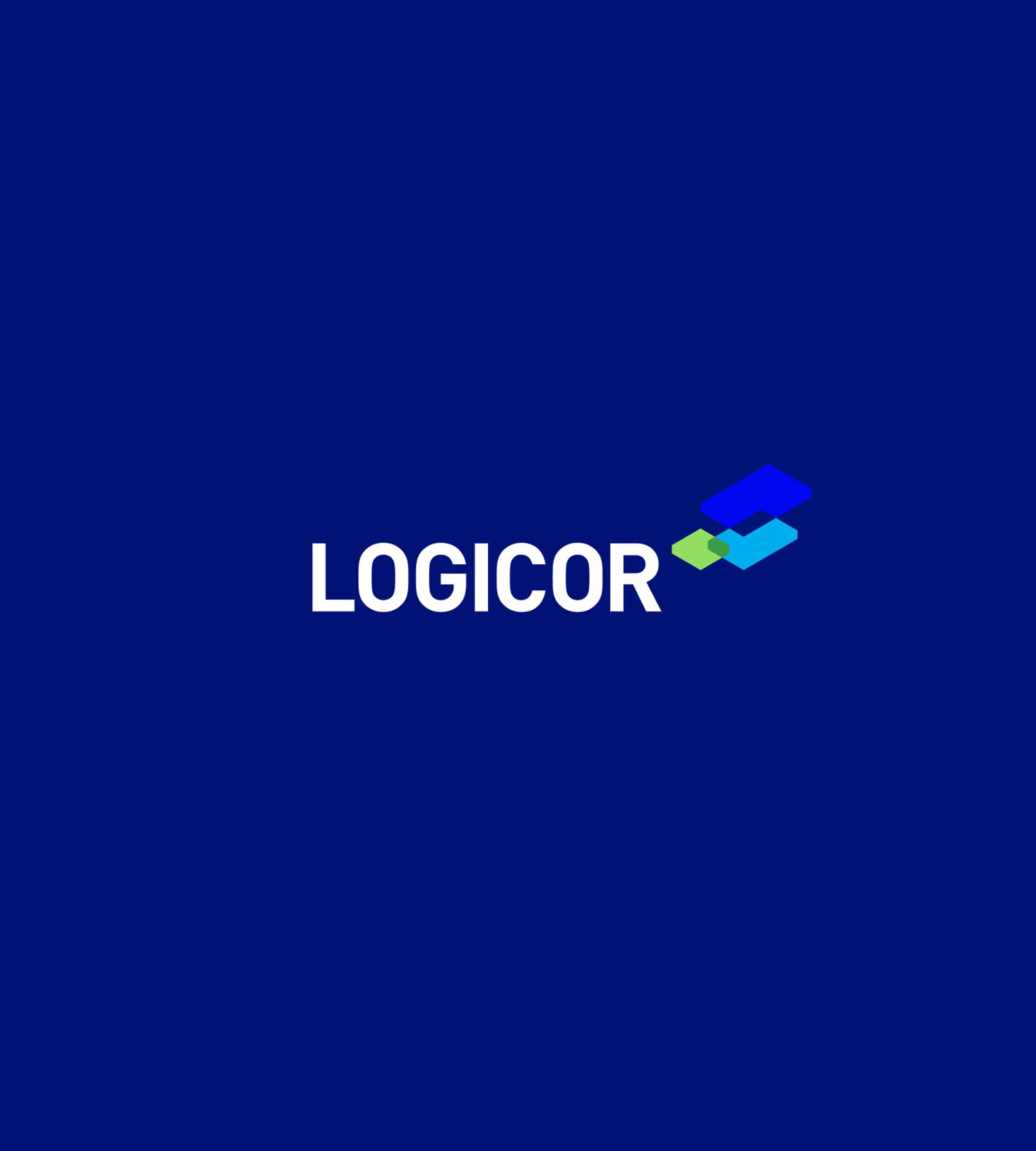
Shapes of logicor logo update
  • Digital First Branding
  • Art Direction
  • Digital Brand Guidelines
  • Customer Research
Logicor.eu

Defining the road ahead

Logicor is a European warehouse and logistics company and while the company is only a decade old, they span 20 countries, 600 warehouses and 13.6 million sqm of space. The Logicor portfolio covers several key markets along major transport and trade routes across Europe.

When Logicor last rebranded in 2015, the corporate identity design was developed in isolation — without strategic planning. This caused problems for the business moving forward; for a sizeable brand with high-profile customers including Amazon, Tesla and DHL, it’s essential to be extra-clear on mission, strategy and deliverables.

Logicor needed to establish a clear strategy and bring global employees, stakeholders and partners together under a shared identity — that’s why they came to Célibataire.

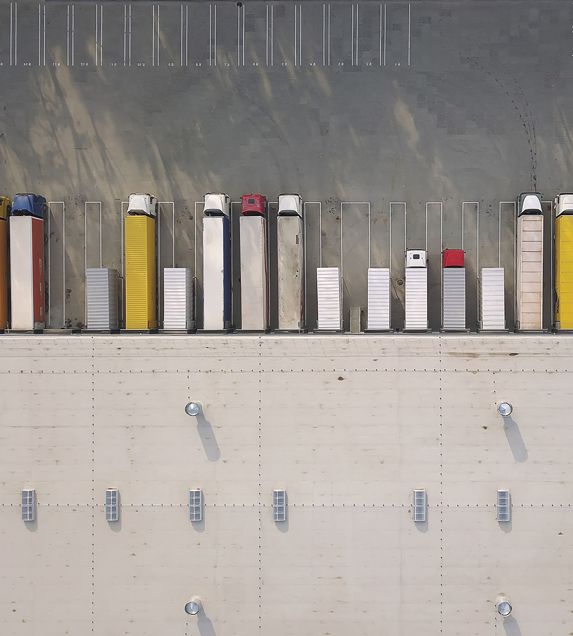
Film lorries
logicor logo blue background

Célibataire's solution

During 2020 we worked on a new brand strategy for Logicor in partnership with specialist consultants. This included defining the company’s purpose, values, proposition, vision and tagline, which were then shared publicly with clients and prospective customers.

Following this project’s completion in 2021, we then moved on to develop a new visual identity for Logicor which properly supports and reflects their new strategy.

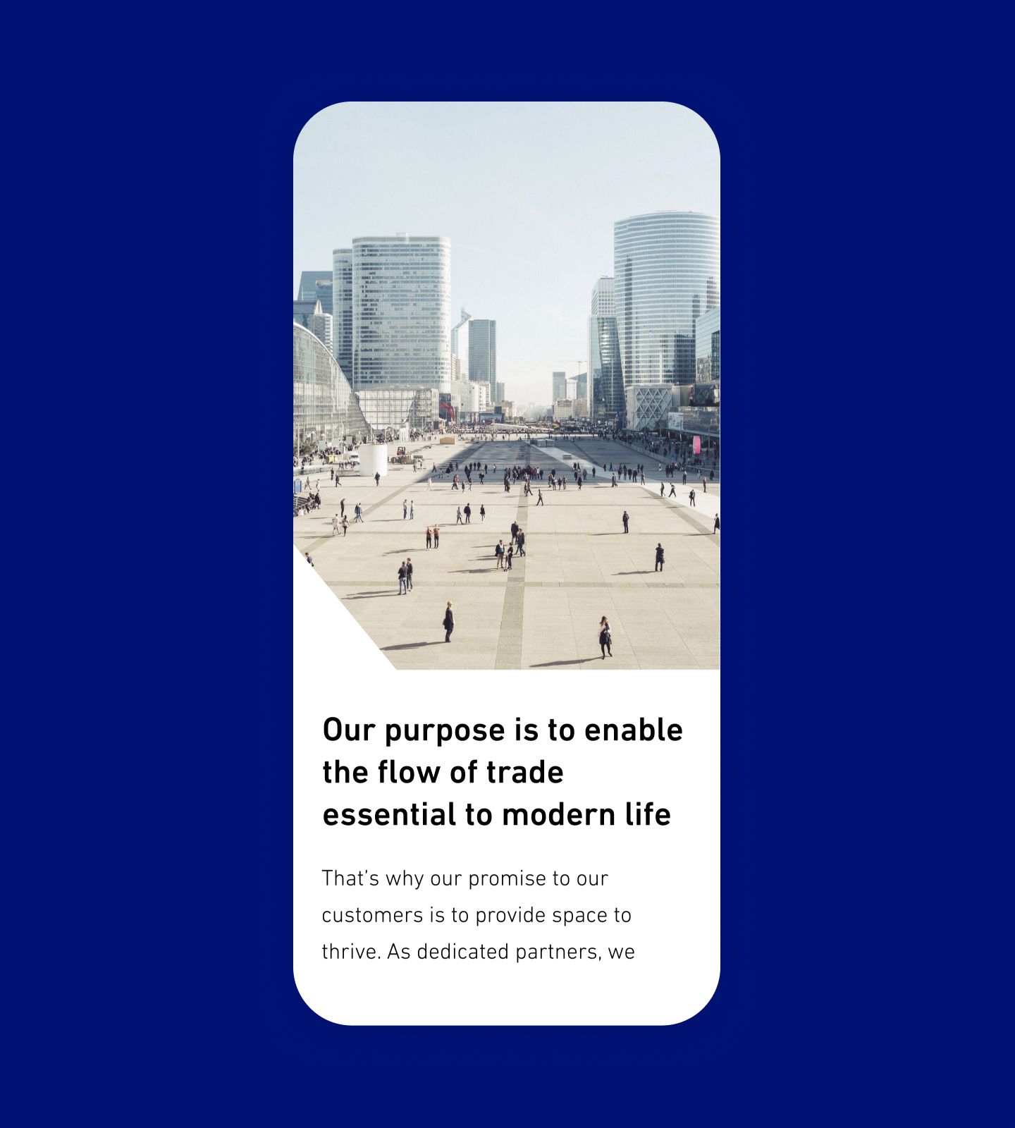
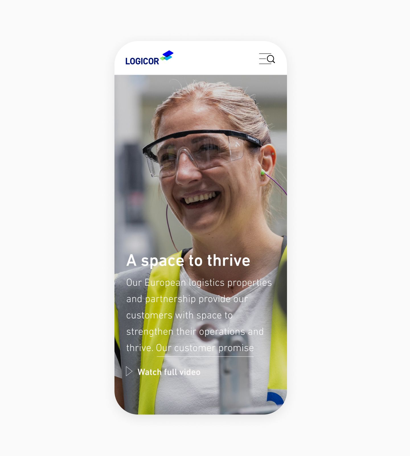
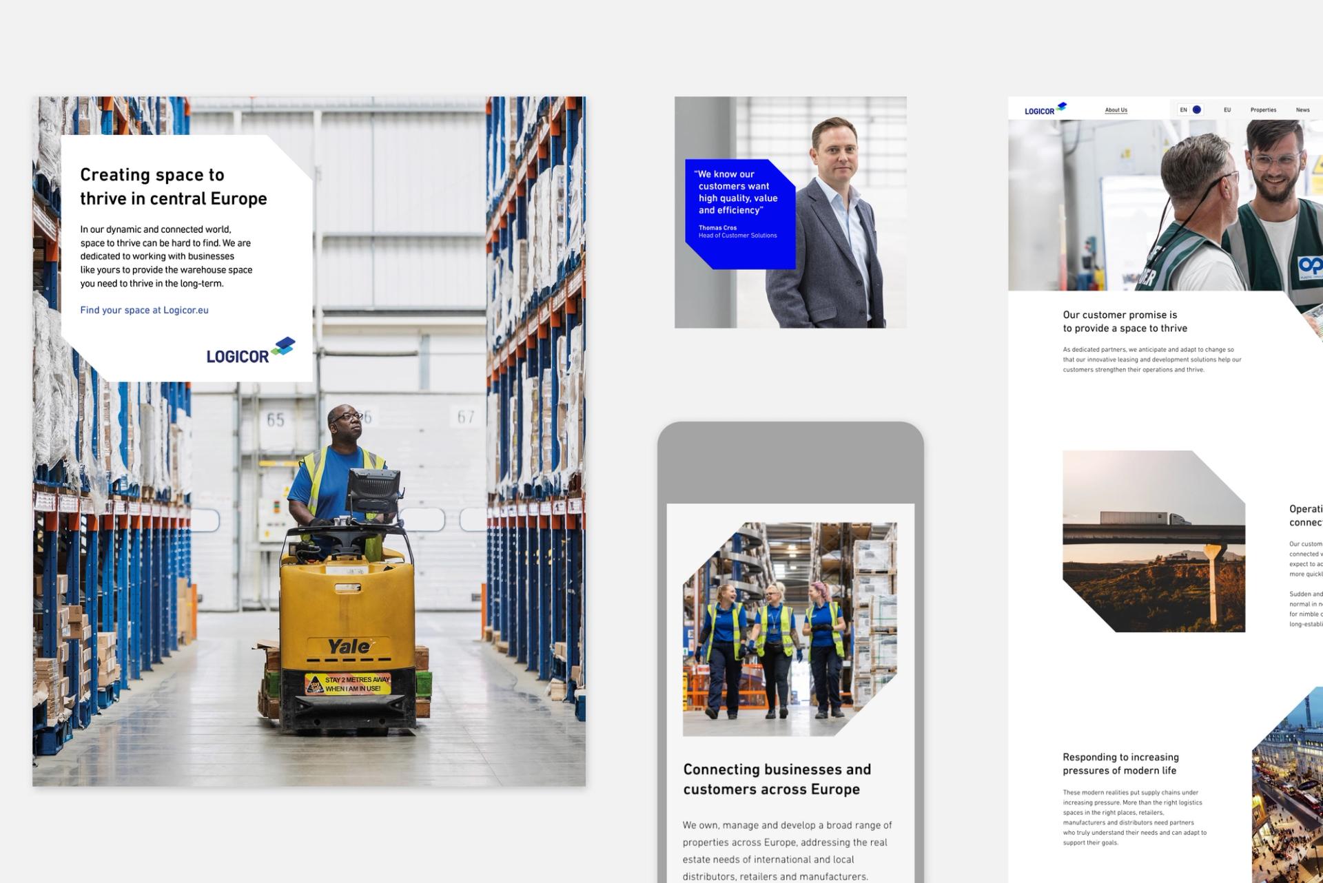
Mobile page design
Mobile homepage design
Mobile page design
Mobile homepage design
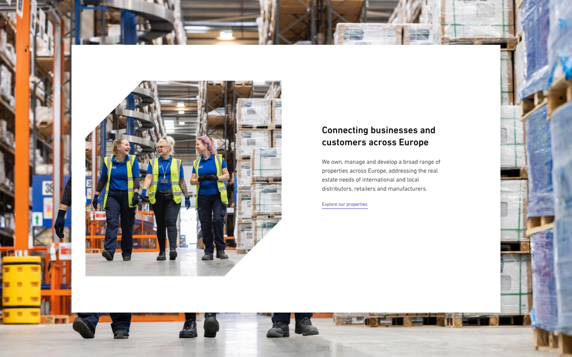
Desktop page design

In line with the Logicor Brand Analysis and Benchmarking report, we explored adjustments to the company’s logo, colour, typography, photography and graphic device. Each of Logicor’s visual identity elements were reviewed and revamped to better align and support the new Logicor voice and customer positioning: “Space to thrive”.

Brand assets

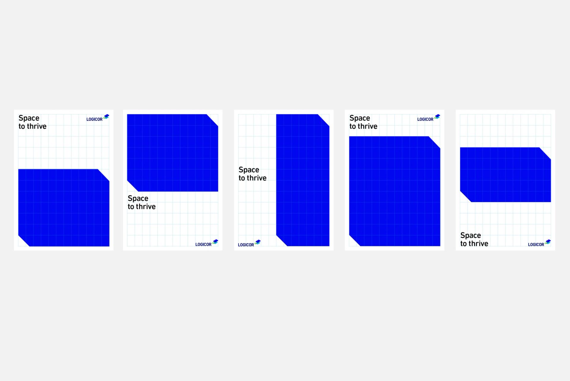
We embraced a simple, bold graphic language for Logicor and a secondary identity (“the Box”) was produced to work across a variety of formats.

The Box is a flexible graphic device, designed to act as a metaphor for the brand strategy “Space to thrive”.


A custom, comprehensive icon library was also created — each icon was designed to work small-scale and to follow a unified, monochromatic colour palette. The application of this shared, visual language across all of Logicor’s 600 warehouses and various materials was crucial in overcoming verbal language barriers and bringing Logicor’s employees, stakeholders and other partners together.

Logicor shape

Logicor’s colour palette underwent significant transformation during this project — the brand’s original navy and green were too easily confused with competitors and had legibility issues on certain collateral. Today, with blue as the primary colour and a wider application of white space (“Space to thrive”), Logicor’s colour palette further supports the intended brand values.

Impact

We have been rolling the strategy out across Logicor’s brand assets, including their tone of voice, content, their physical presence at exhibitions, corporate documents and presentations to date — and the early results are looking promising.

Stronger brand recall and trust among customers are achieved via clearer colour prioritisation, as it improved accessibility (raising the accessibility rating from 33% to 42%). There’s an overall consolidation of the visual language and a more cohesive, consistent message. Now, when asked, people associate Logicor with approachability and warmth, which is exactly what this project set out to achieve.

Latest Insights

See more