P2P

Bringing a new sports brand to life

Birdseye view of golf course
  • Product Design
  • UX
  • UI
  • iOS
p2pgolf.com

Delivering a total solution

An innovative service launched in 2022, P2P is a mobile app that acts as a social network for golfers. The platform enables users to connect with new players in their preferred area before allowing them to find a course, book a tee time, invite contacts, and start playing.

During the initial planning phase, P2P knew the platform needed to deliver on three core objectives to succeed in such a competitive lifestyle-oriented marketplace: First, to create a digital experience that met – and exceeded – the expectations of golfers wishing to source and organise games. Second, to serve as a tool to help the P2P sales team attract golf clubs to sign up to the platform. And finally, any solution must be scalable and offer white-labelling options for potential partners to ‘re-skin’ the app with their own branding.


Ironically, as P2P was a start up, the company itself only had limited brand collateral in place; namely a logo. This meant as well as needing a digital design agency to create the app, P2P also required a digital-first creative partner capable of delivering a complete brand solution too.

Célibataire's solution

Because of Célibataire's proven expertise in technical and brand development, P2P decided we were ideally placed to deliver on its ambitious multi-disciplinary goals. We teed off the process by defining P2P’s brand, using mood boards to establish a creative direction for the start up’s core brand architecture.

We created an overall vision that reflected the platform’s sporting and social aspirations while also future-proofing the brand. This latter aspect was vital to P2P’s partnership strategy with our solution delivering the flexibility required to not only meet the start up’s immediate plans – but to support its future sponsoring needs as well.

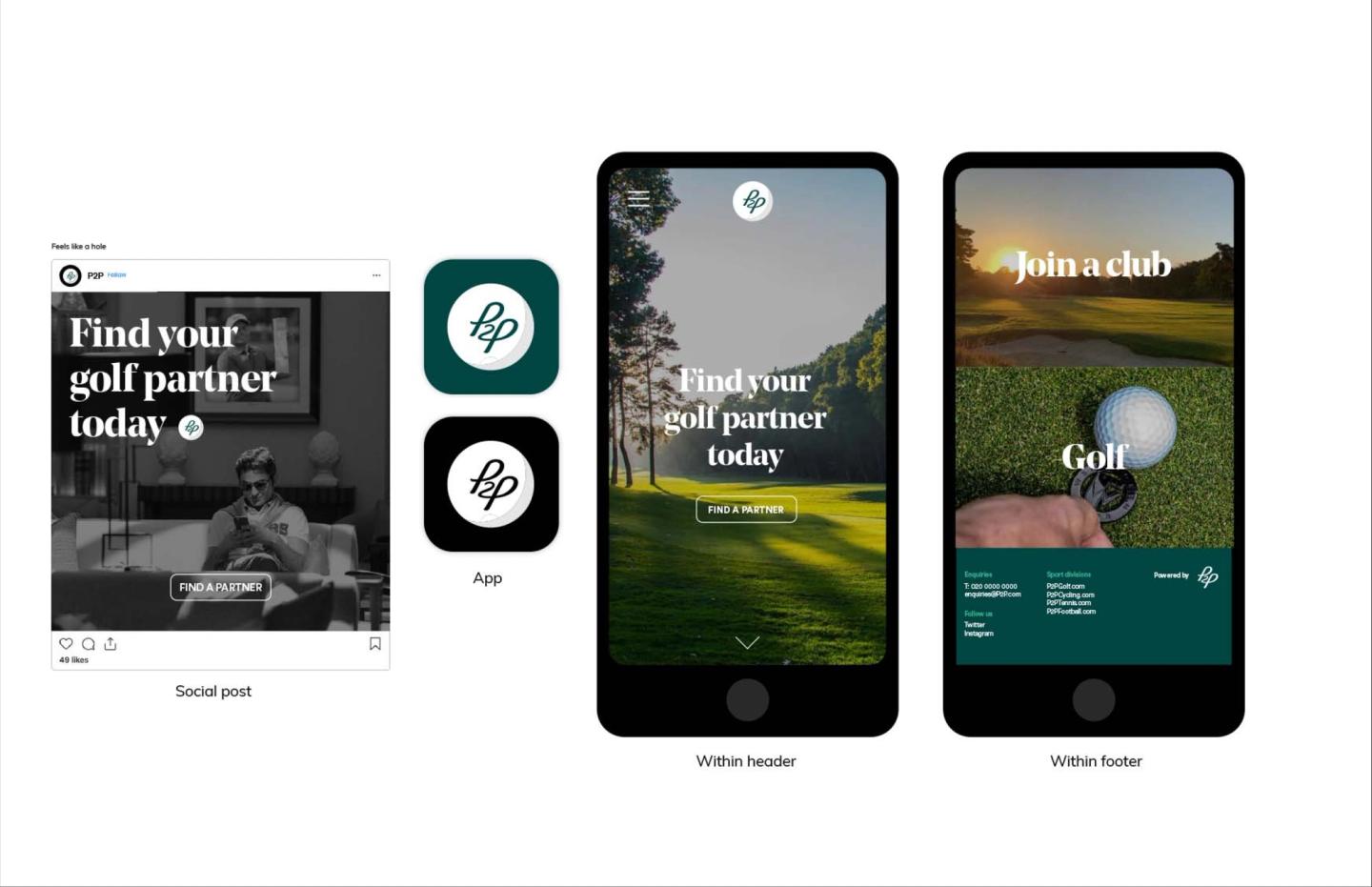
Once the brand architecture was signed off, we turned to P2P’s design system, developing its brand identity and design principles. This included generating a series of visual and textual concepts that captured all aspects of the brand from colour palette and typography to imagery, iconography and tone of voice.

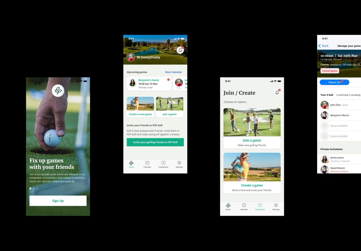
P2P app UI screens
P2P app UI screens

With branding agreed upon, work began on the app itself. User research was conducted to identify personas as well as map the digital customer journey needed to fully realise the app’s social network potential. Focusing on simplicity and immediacy, we designed a platform that made connecting, inviting and choosing effortless. This was all delivered via a user interface that offered familiar selection options such as dates and times to ensure users felt immediately ‘at home’ when firing up the app for the first time.

To deliver a successful launch at speed, a minimum viable product approach was adopted, enabling P2P to deliver the app into the marketplace quickly so it could source vital feedback from early adopters. This was used to iterate the product as operations were scaled up based on emerging user wants and needs.

Crucially, while the app was initially iOS-only, we created material guidance for launching Android support at a later date. This has ensured there have been no unexpected operating system-related bottlenecks that might have hindered Android-based customer journeys or impacted negatively on the brand.

P2P brand elements
P2P brand elements

The results

After going live earlier this year, the P2P app has already made significant inroads into the golfing community, driven by a new partnership with the prestigious Goodwood Golf Club. Users say the appeal of the app is the UX design’s simplicity combined with a brand that successfully embodies the sport as well as the lifestyle associated with it.

Finally, because of the success of Célibataire’s branding guidelines and the flexibility of the app, P2P is now pursuing plans to bring its innovative service to other sports. In other words, watch this space.

Latest Insights

See more